Accordion Icon UX: Which Symbol Actually Works
A 136-person NN/g study tested caret, arrow, plus and no-icon on mobile accordions. Only one symbol beat having no icon at all.
Tap the wrong spot on a mobile FAQ section and nothing happens, or worse, you get carried off to a different page entirely. That small frustration is the subject of one of the more useful pieces of interface research to come out this year: a test of which icon actually tells a mobile user “tap here to see more,” and which ones just look like they should.
The accordion is the collapsible content block you see everywhere on mobile: FAQ pages, settings menus, product spec sheets, restaurant menus. A row of text sits closed until you tap it, then it expands to reveal more content underneath. Nearly every version of it carries a small icon on the right edge, meant to signal that the row opens. Design teams pick that icon by habit more often than by evidence, usually inheriting whatever a component library shipped with. The Nielsen Norman Group (NN/g), the user-experience research firm founded by Jakob Nielsen and Don Norman, decided to actually test the assumption instead of repeating it.
What NN/g actually tested
NN/g ran a formal test rather than a design opinion piece. The firm used first-click testing, a method where researchers watch exactly where a person’s first tap lands on a screen and whether that tap gets them the result they expected, administered through the testing platform UserZoom. The study involved 136 participants working through 11 mobile prototypes spanning different industries, from retail to finance to healthcare, each one carrying an accordion built with a different icon.
Five treatments went head to head: a caret (the simple chevron, pointing down when closed and up when open), a plus sign, an arrow, a deliberately meaningless “foil” icon designed to look plausible but signal nothing, and a control group with no icon at all. Putting a nonsense icon and a blank row into the same test as the caret and the arrow was the clever part. It let the researchers separate “this icon genuinely helps” from “any icon feels more reassuring than an empty row,” a distinction most design debates never bother to make.
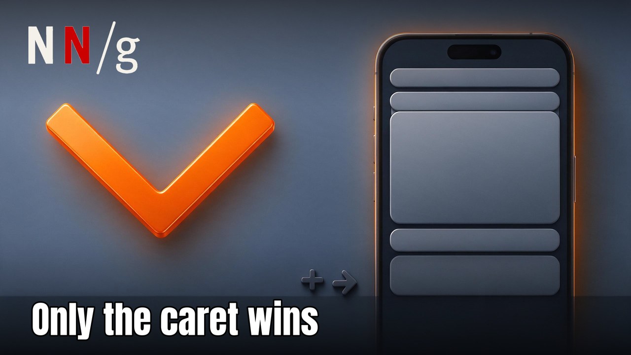
 A caret rotated open on a mobile accordion row — the one icon that beat showing no icon at all.
Only one icon beat having no icon
The headline finding is specific enough to be useful rather than just reassuring. Across the 11 prototypes, the caret was the only standard icon that performed statistically better than the meaningless foil icon or no icon at all. Participants shown the caret were more likely to tap directly on the icon itself, not just the text label next to it, a behavioral signal that they correctly read the icon as the interactive trigger rather than decoration.
That detail matters more than it sounds. An icon that people avoid tapping, or tap only by accident while aiming for the label, isn’t doing its job even if it looks right. The caret’s advantage held in NN/g’s data as a stronger, more consistent expectation that tapping the row would expand content in place rather than navigate somewhere else. None of the other tested icons produced that same confident, predictable tap behavior.
The arrow didn’t clear the same bar
The arrow is, by a wide margin, the most commonly deployed icon for this exact pattern across real-world design systems, and it is worth sitting with what NN/g actually found about it: the arrow was not statistically different from the meaningless foil icon or from showing no icon at all in this test. That is not the same claim as “the arrow is bad.” It is a narrower and more precise finding: in this specific protocol, with this sample size and these 11 prototypes, the arrow did not produce a measurable improvement in user behavior over having nothing there at all.
An arrow is visually overloaded with meaning elsewhere on the web. It points to “go to the next page,” “download this,” “proceed,” or “this links out to another destination,” depending on context. An accordion row asks it to mean something different: “stay right here, I’ll just open up.” The caret has one job and no competing associations, and that focus appears to be exactly why it reads more reliably as a trigger.
 A split button row: label and arrow icon as two separate tap targets — the pattern NN/g flags as risky.
Split buttons spread the intent too thin
The study also looked at a layout choice that shows up constantly in app settings screens and e-commerce menus: the split button. In this pattern, the row’s text label is one clickable target that navigates to a dedicated page, while a separate icon sits beside it as its own clickable target that expands the row in place without navigating anywhere. Two different actions, visually crammed into one row.
NN/g’s research flags this pattern as explicitly risky rather than a safe, proven convention, despite how often it appears in production design systems. Participants in the study tapped the label and the icon at roughly similar rates, meaning a meaningful share of users got an outcome they weren’t expecting, either staying on the page when they wanted to navigate, or navigating away when they only wanted to peek at the content. The row looks tidy to a designer reviewing it in a file. To a thumb moving fast on a phone, it is two affordances competing for one tap, and the test suggests users cannot reliably tell them apart.
Why this is worth more than a style preference
None of this is really about which icon looks nicer in a mockup. It’s about the smallest possible cost a product can impose on a user: one accurate tap instead of a guess, a bounce, or an unwanted page load. Multiply that tiny friction across thousands of visits to a pricing FAQ or a help center, and a mis-tapped icon becomes measurable lost time and abandoned sessions, the kind of thing a support team feels without ever tracing it back to an icon choice.
The useful takeaway isn’t “always use a caret and never an arrow.” It’s that icon choice for a repeatable interaction pattern is worth testing rather than inheriting, because an icon that looks self-explanatory to the person who designed it is not the same as an icon that reads correctly to someone tapping through a screen in five seconds between meetings. The caret happened to win this particular test. The deeper point is that it won because someone bothered to ask the question with real users and a real control group, not because it’s intrinsically the “correct” symbol.

FAQ
What icon should I use for an accordion on mobile?
Based on NN/g’s testing, a simple caret (a chevron that rotates between pointing down and up) was the only icon that performed measurably better than showing no icon at all. It produced more accurate taps directly on the icon and a stronger, more consistent expectation that the content would expand in place rather than navigate elsewhere.
Is the arrow icon wrong for accordions?
Not exactly. NN/g’s research found the arrow icon was not statistically different from a meaningless control icon or no icon at all in this specific test, a narrower finding than calling it wrong outright. The arrow simply carries competing meanings (next, forward, link out) elsewhere on the web that may dilute its clarity inside an accordion specifically.
What is a split button accordion, and why is it risky?
A split button accordion places two separate tappable zones in one row: the text label navigates to another page, while a separate icon expands the content in place. NN/g found users tap both zones at similar rates, meaning a sizable share land on the outcome they didn’t intend, so the pattern is flagged as ambiguous rather than safe.
Does the icon choice actually affect conversions or engagement?
Indirectly, yes. An icon that users don’t tap correctly means some visitors never see the content it was meant to reveal, whether that’s a pricing detail, a shipping policy, or a product spec. On a page with several accordion rows, like an FAQ or settings screen, those small missed taps add up to real lost engagement, even though no single tap looks like a failure in isolation.
Should accordion icons be removed entirely since the arrow performed similarly to no icon?
No. The no-icon control group existed as a baseline for comparison, not as a recommended design, and NN/g’s data still shows the caret clearly outperforming it. The finding is that the arrow didn’t clear the bar the caret did, not that icons are unnecessary. A caret, or a similarly singular and unambiguous symbol, still gives users a clearer signal than an empty row.